Fresh and clean air by design
Tak Air is a technology-focused company that designs air purification and ventilation systems. They hold several patents in their field and help define new standards in industry committees. Their communication material included detailed specifications, many formulas and 3d graphics.
While business was doing well in the B2B segment, they also wanted to convince homeowners and tenants of their solutions for better air quality. With the existing brand and communication material that proved to be difficult. A systematic and convincing visual identity and messaging was lacking, especially for end-users. As brand consultants we often face this challenge: excellent technology that is readily understood by B2B clients fails to reach less knowledgeable customers or end-users.
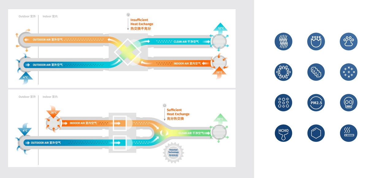
Charts and graphics are nice but not every customer is likely to spend the time to immerse themselves in the technology behind clean and fresh air. They just want clean and fresh air, and the brand must be able to convey that promise credibly, otherwise the detailed charts will not get a thorough look.
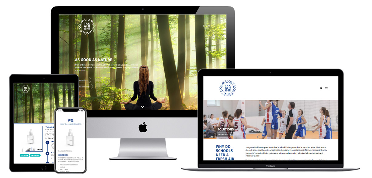
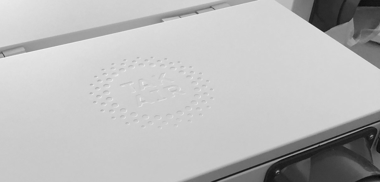
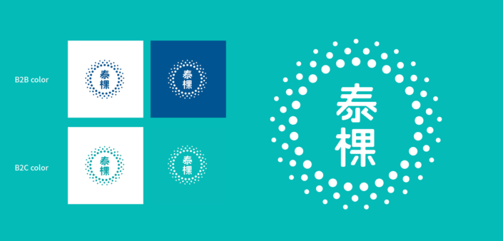
In the first part of our work, we therefore also had to convince our client that not only the visuals but also the whole communication needs to change and be made more tangible. The new brand logo communicates the freshness and positivity that comes with being able to breath fresh but clean air. Instead of 3d product renderings or beautiful interiors we depict rested and refreshed personalities, nature scenes like forest and mountain environments that remind you how joyful and calming breathing fresh air is.
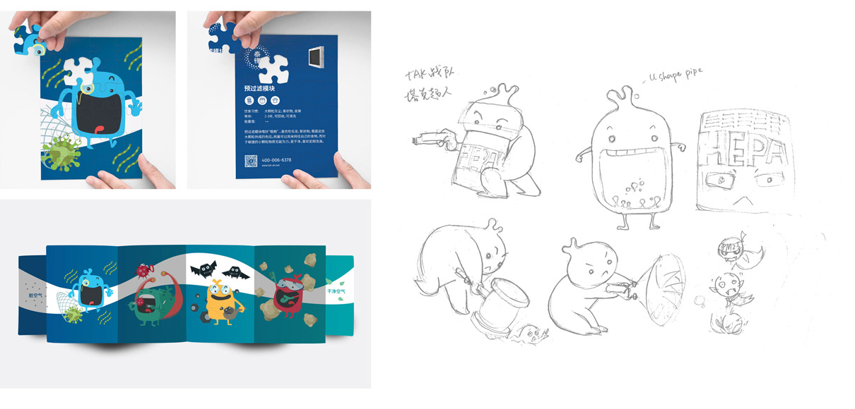
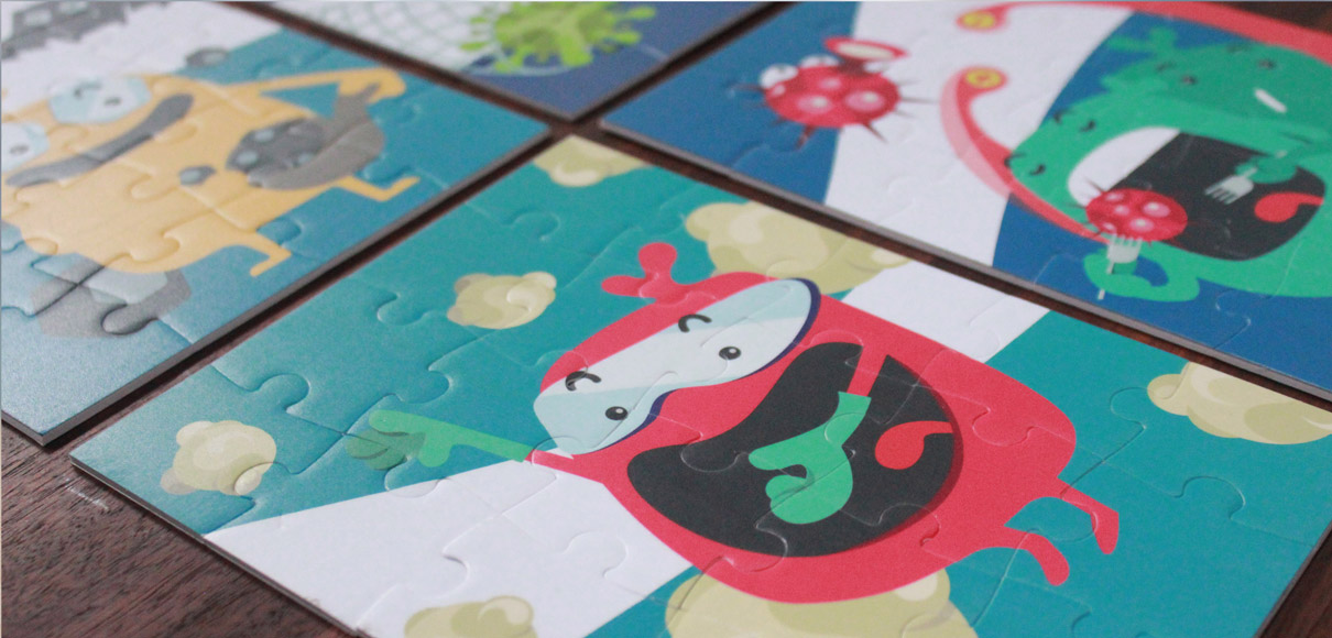
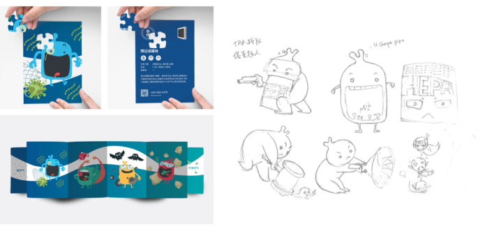
With the basic brand design and visuals defined – logos, brand pattern, slogans, color system and iconography – we implemented a wide range of items, including promotional designs for face masks and a set of puzzles, each of which explains one type of harmful particle that the system removes. The character development for the puzzle was fun and opened a new channel to approach residential customers but also appeals to B2B clients like kindergartens.
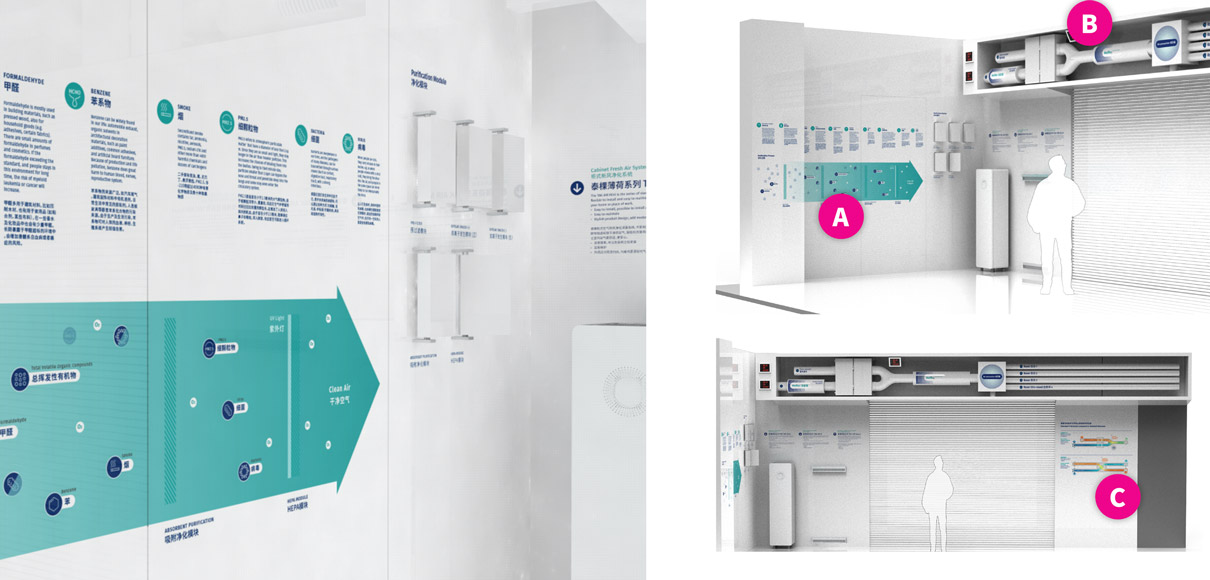
The showroom at the company headquarter was our final assignment on this journey: the design includes wayfinding, brand applications and a product exhibition with detailed explanations.
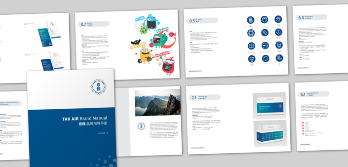
With a new brand book surpassing the 100-page mark, our client is now well equipped to communicate in multiple languages: English, Chinese, B2C and B2B.


