")


Engage, Learn, Grow
For over a decade ELG (Essential Learning Group) has been helping children with special needs by providing educational, developmental, behavioral and mental health services in China. Having established themselves as leading experts in this niche market, ELG realized it was time to take the brand identity to the same level.
Starting point: previous ELG name and design elements
As is true for all branding projects, the needs and expectations of different target groups must be well understood before any meaningful design concepts can be developed: schools and health care professionals that refer student and patients to ELG, parents, children as well as ELG founders and staff. As an external party, we conducted several interviews to collect unbiased insights that proved very valuable for the further design development.

“Energy Line”
The core of new brand identity is also the core literally: A high-contrast black inner line at the center of the ELG letter mark. We call it the “Energy Line”, and it visualizes the idea, that inside each person, there is a discernible inner strength that ELG is helping to bring out and develop.
To reflect warmth, friendliness and accessibility of the ELG team, the ELG logo is not static but can be extended flexibly to support various messages.
![]()
Like a doodle, the “Energy Lines” can end in a flower drawing for invitations, a jumping kid to indicate the activity room and many more.
The lead color orange is interculturally perceived as active and warm, aligning well with ELG’s strong emphasis on personal, cognitive and physical development in a safe environment.
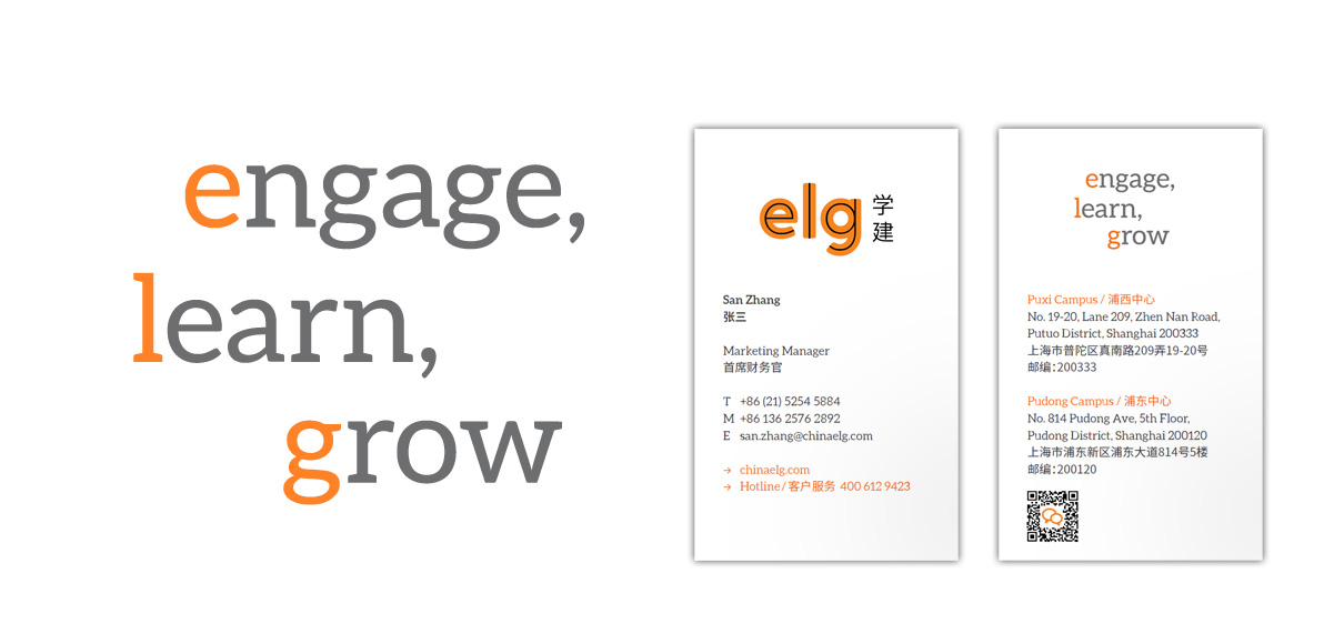
A major change is the introduction of a fitting and memorable slogan connects with the ELG letter mark in most applications. Instead of the previously used “The [sic] Essential Learning Group”, ELG now stands for “Engage, Learn, Grow”. The drive, process and purpose of ELG becomes more clear in simple but memorable language.
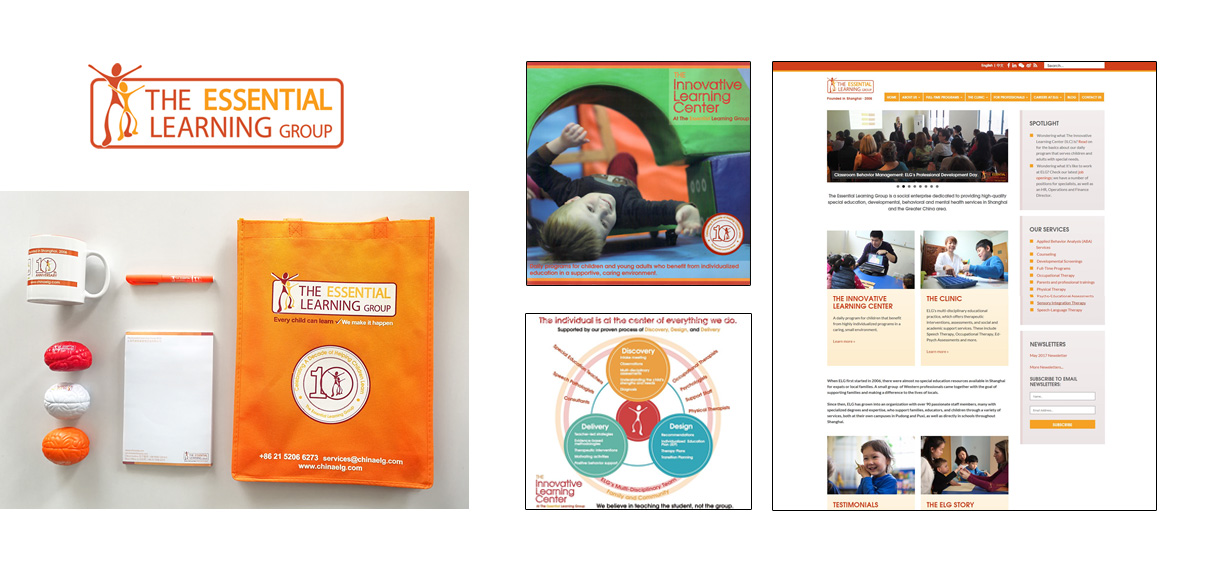
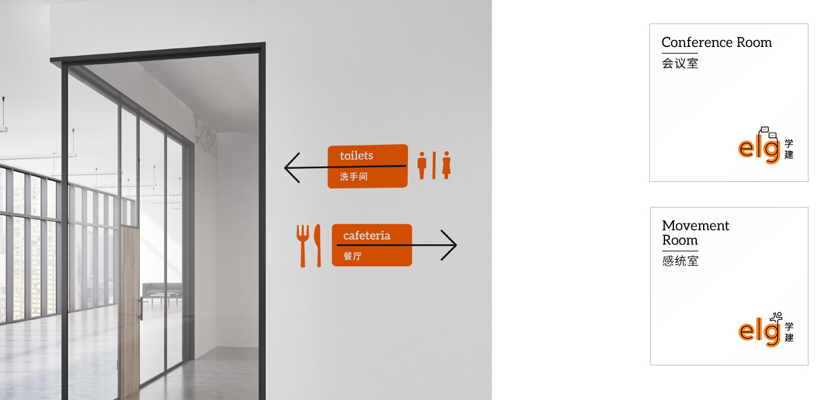
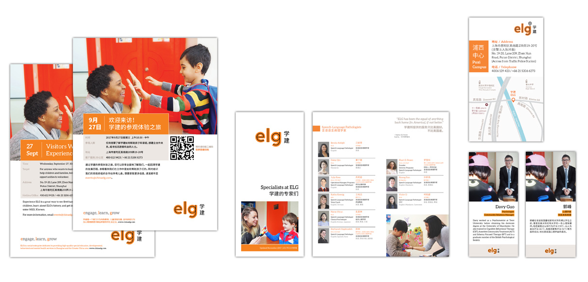
We implemented the new brand identity in stationery, uniforms, marketing brochures and leaflets, branded corporate gifts, signage and wayfinding system. JungleFish designed a custom reception table, selected furniture and specified interior design principles that align with the brand tonality.
JungleFish thoroughly enjoyed this project with ELG’s highly competent and motivated team. From kick-off to the final hand-over, our teams engaged actively on both sides, learned many new things and finally managed to really grow the brand together.
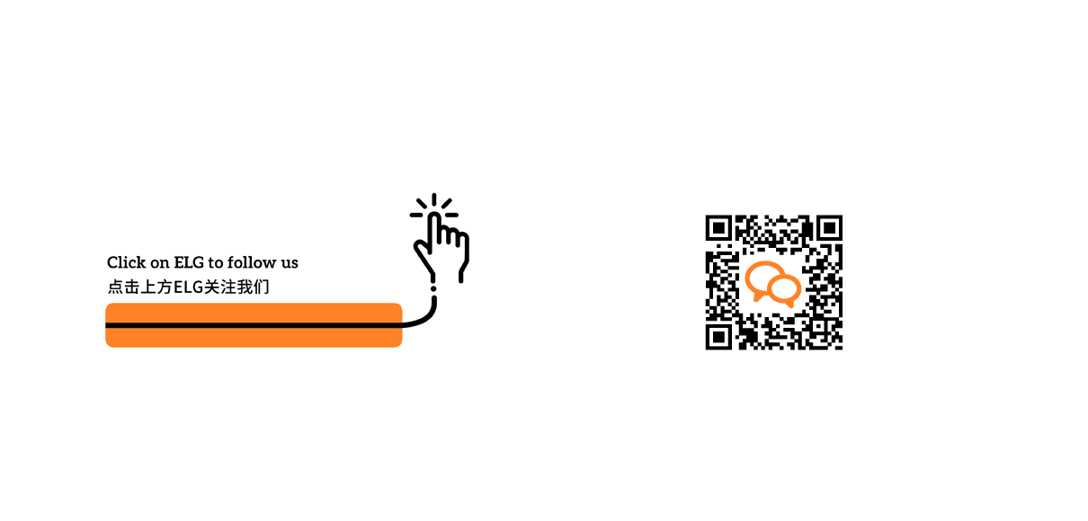
If you want to learn more about ELG and receive expert articles on education follow their – very educational – WeChat channel or visit www.chinaelg.com